NMG Design
The Brief
Wheelie Good Bikes came to me with the need for a brand design and logo configuration. I created a cohesive brand identity through collateral, merch, and signage while also making the existing logo design more accessible and versatile.
Wheelie Good Bikes Branding
Lead Graphic Designer/Creative Consultant
Fall 2025 - Spring 2026
Go back
Problem
They needed to have a brand designed that represented what they were looking to stand for, and the vibe they were looking to put out. The owner wanted to be more welcoming and family-friendly than most bike shops in the city, while also maintaining an air of business that can be efficiently promoted.
Design Intent
- Establish a brand that incorporates the client's desired theme
- Bring together an outdoor sport and community in a way that is not typical of a Chicago bike shop
- Keep the brand family-friendly while continuing to be marketable and professional
- Emphasize hospitality and community
Insight
This project was about taking a good step forward for a first-time business owner while also allowing the brand to speak for the friendliness and passion that the business stemmed from. The goal was to remain marketable to a large demographic, but have some fun along the way.
Outcome
We ended up with a brand that centered around a friendly and fun mascot that is versatile for application to collateral and also recognizable. The branding came together effectively and was realized perfectly in the physical space.
Process
This is one of the original AI-generated images of what the owner wanted to have as the logo. As you can see, the feet of the dog are a bit weird-looking, and the back tire of the bike looks like it's melting into the ground. This was also not a real typeface; just a bunch of vector lines as the outline of the letter forms. This logo needed to have some tweaking to make it palatable and realiable as the carrier of the brand.
Taking the aforementioned logo visage into account, I started to plan out the branding by selecting a color palette and a range of typefaces that I thought represented the brand most effectively. After sitting down with the owner and discussing options, we settled on the color palette that you see to the right–bright but not childish, outdoorsy but also easy to replicate for community collateral–and the typeface of Brevia from the list of options on the left.
Adjusting the vectors in the originally generated image, I managed to create a more cohesive-looking logomark with an actual typeface implemented into the design. The color palette applied also ties the image together and makes for a versatile alteration of colors for the logo to be visible on various backgrounds.
The first iteration involved the brand name on the same type path with the bottom section mirroring the top, but we teaked it a bit and had the bottom section be inverted which made for a better-looking design.
The border around the main focal point was intended to represent the classic look of a tan-walled bike tire. Having a main focus of blue being the most prominent color in the logo, between the title and the bikes color itself, this adds a relaxed and inviting feel to the brand as a whole.
Here are a few examples of alternative logos for the brand when considering different merch, collateral, and colors the brand may be placed on. An abbreviated logo scaleable to different sizes of merch comes in handy when working with hats, stickers, buttons, patches, etc. These are more simplified color palettes as well to take into consideration the cost of multi-colored merchandise. By incorporating more of the accent color, red, this helps to make the rest of the logo stand out and remain consistent across branding.
Final Rendering


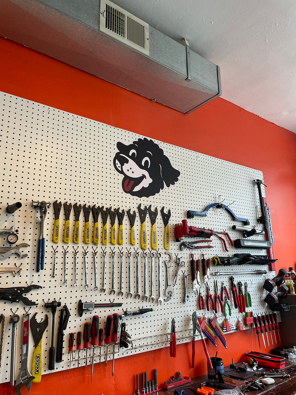


Here are some finalized photos of the brand across different collateral and merch options. You can see the various alternates that were used based on the desired visual outcome. To minimize cost across printed materials (t-shirts, buttons, stickers), the amount of colors were condensed to make the product remain within the brand guidelines outlined while also keeping to the keywords designated for the feeling the brand should emit.